
Most notes and code are from:
Data Visualization
- 1. Univariate Plotting
- 2. Bivariate Plotting
- 3. Seaborn Plotting
- 4. Seaborn Faceting
- 5. Multivariate Plotting
- 6. Plotly
- 7. Grammar of Graphics
- 8. Time-series plotting
import pandas as pd
import re
import numpy as np
pd.set_option('max_columns', None) # show the max columns
df is the dataset
'X' is the X-axis name
'Y' is the y-axies name
1. Univariate Plotting
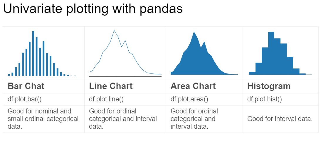
1.1. Bar Chart
- Y is the total amount counts of each X
df['X'].value_counts().head(10).plot.bar()
- Y is the proportions of each X
(df['X'].value_counts().head(10) / len(df)).plot.bar()
- Sort the ordinal categories X
df['X'].value_counts().sort_index().plot.bar()
1.2. Line Chart
- Sort the ordinal categories X
df['X'].value_counts().sort_index().plot.line()
1.3. Area Chart
- Sort the ordinal categories X
df['X'].value_counts().sort_index().plot.area()
1.4. Histogram Chart
- Deal with the skewed data and limit up to 200
df[df['X'] < 200]['X'].plot.hist()
- Basic histogram chart
df['X'].plot.his()
2. Bivariate Plotting
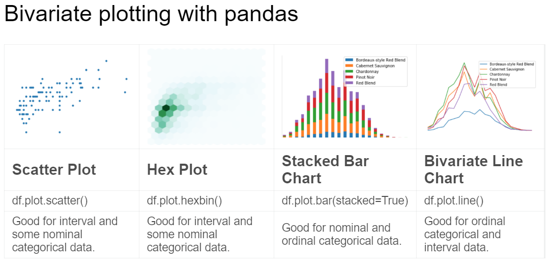
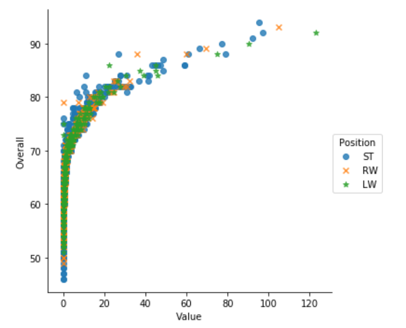
2.1. Scatter Plot
This map is often used to show the correlation between two variables
It works best with a mixture of ordinal categorical and interval data.
- Map X to Y in 2_D space (limit X up to 100)
df[df['X'] < 100].sample(100).plot.scatter(x = 'X', y = 'Y')- To downsample data is also important to prevent overplotting
2.2. Hexplot
- Hexplot is a way to deal with overplotting
'df[df['X']<100].plot.hexbin(x='X',y='Y', gridsize = 15)
2.3. Stacked Plots
Often with nominal categorical data
- Reform the data with the groupby X to counts amount y with 2 variables
reform_df = df.groupby(['X_1','X_2']).mean()[['variable_1','variable_2']]
- Dealing with the probelm: one categorical variable in the columns, one categorical variable in the rows, and counts of their intersections in the entries
df.plot.bar(stacked=True)in bar plotsdf.plot.area()in area plots
2.4. Bivariate Line Chart
Better with interval data
- Reform the data with the groupby X to counts amount y with 4 variables
reform_df = df.groupby(['X']).mean()[['v_1','v_2','v_3','v_4']]
- Multiple lines on the same chart
df.plot.line()
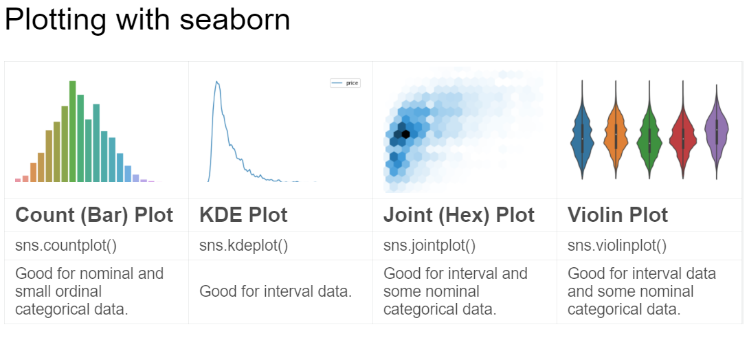
3. Seaborn Plotting
import seaborn as sns is a standalone data visualization package
3.1. Trends
A trend is defined as a pattern of change.
3.2. sns.countplot
- Same as pandas’
value_countswhich is equivalent bar plotsns.countplot(df['X'])
3.3. sns.lineplot
- Line charts are best to show trends over a period of time, and multiple lines can be used to show trends in more than one group.
3.4. Relationship
There are many different chart types that you can use to understand relationships between variables in your data.
3.5. sns.barplot
- Bar charts are useful for comparing quantities corresponding to different groups.
3.6. sns.heatmap
- Heatmaps can be used to find color-coded patterns in tables of numbers.
sns.scatterplot - Scatter plots show the relationship between two continuous variables; if color-coded, we can also show the relationship with a third categorical variable.
ef = (df.loc[:,['Val_1','Val_2','Val_3','Val_4','Val_5']].applymap(lambda v: int(v) if str.isdecimal(v) else np.nan).dropna()).corr()
sns.heatmap(ef, annot = True)
3.7. sns.regplot
- Including a regression line in the scatter plot makes it easier to see any linear relationship between two variables.
3.8. sns.lmplot
- This command is useful for drawing multiple regression lines, if the scatter plot contains multiple, color-coded groups.
sns.lmplot(x='X', y='Y', hue='Val', markers=['o', 'x', '*'], data = df.loc[df['Val']isin(['val_1','val_2','val_3'])], fit_reg=False)
3.9. sns.swarmplot
- Categorical scatter plots show the relationship between a continuous variable and a categorical variable.
3.10. Distribution
We visualize distributions to show the possible values that we can expect to see in a variable, along with how likely they are.
3.11. sns.distplot
- Histograms show the distribution of a single numerical variable.
sns.distplot(df['X'],bins=10,kde=False)number of bins to 10
3.12. sns.kdeplot
- KDE “kernel density estimate” plots (or 2D KDE plots) show an estimated, smooth distribution of a single numerical variable (or two numerical variables).
- y axis in this case is how often it occurs
sns.kdeplot(df.query('X < 200').X)
- KDE plots in 2-D (Bivariate KDE)
sns.kdeplot(df[df['X']<200].loc[:,['X','Y']].dropna().sample(5000))sns.kdeplot(df['X'],df['Y'])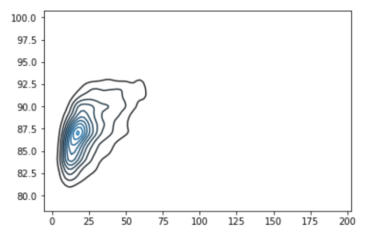
3.13. sns.jointplot
- This command is useful for simultaneously displaying a 2D KDE plot with the corresponding KDE plots for each individual variable.
sns.jointplot(x='X',y='Y',data=df[df['X']<100])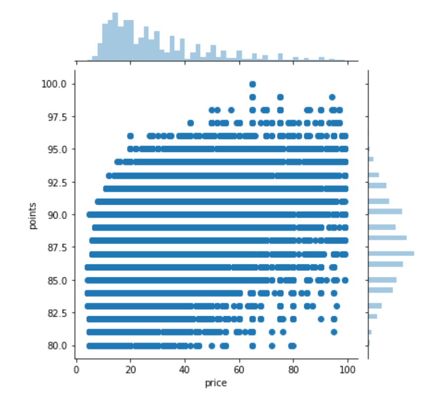
sns.jointplot(x='X',y='Y',data=df[df['X']<100],kind='hex',gridsize=20)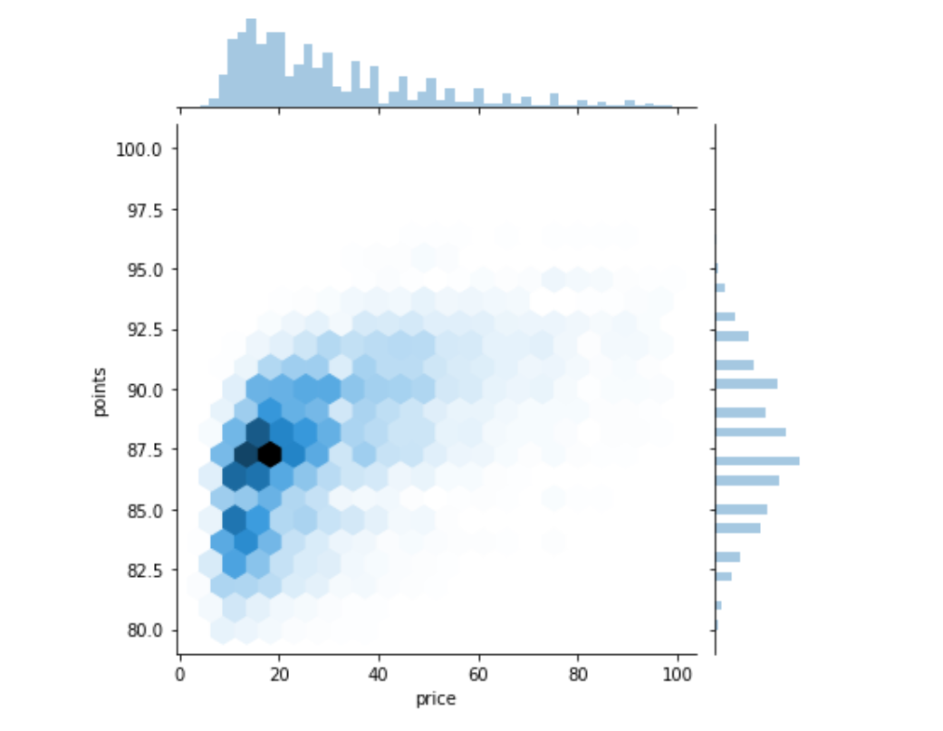
3.14. sns.boxplot
- Boxplot is great for summarizing the shape od may datasets
sns.boxplot( x='X', y='Y', data=df[df.X.isin(df.X.value_counts().head(5).index)] ) - Violin Plot cleverly replaces the box in the boxplot with a kernel density estimate for the data
  sns.violinplot(
  	x='X',
  	y='Y',
  	data=df[df.X.isin(df.X.value_counts()[:5].index)]
      )
3.15. Themes
- Seaborn has five different themes: (1)”darkgrid”, (2)”whitegrid”, (3)”dark”, (4)”white”, and (5)”ticks”
sns.set_style("dark")
4. Seaborn Faceting
Faceting is the act of breaking data variables up across multiple subplots, and combining those subplots into a single figure
It’s a multivariate technique which is very easy to use
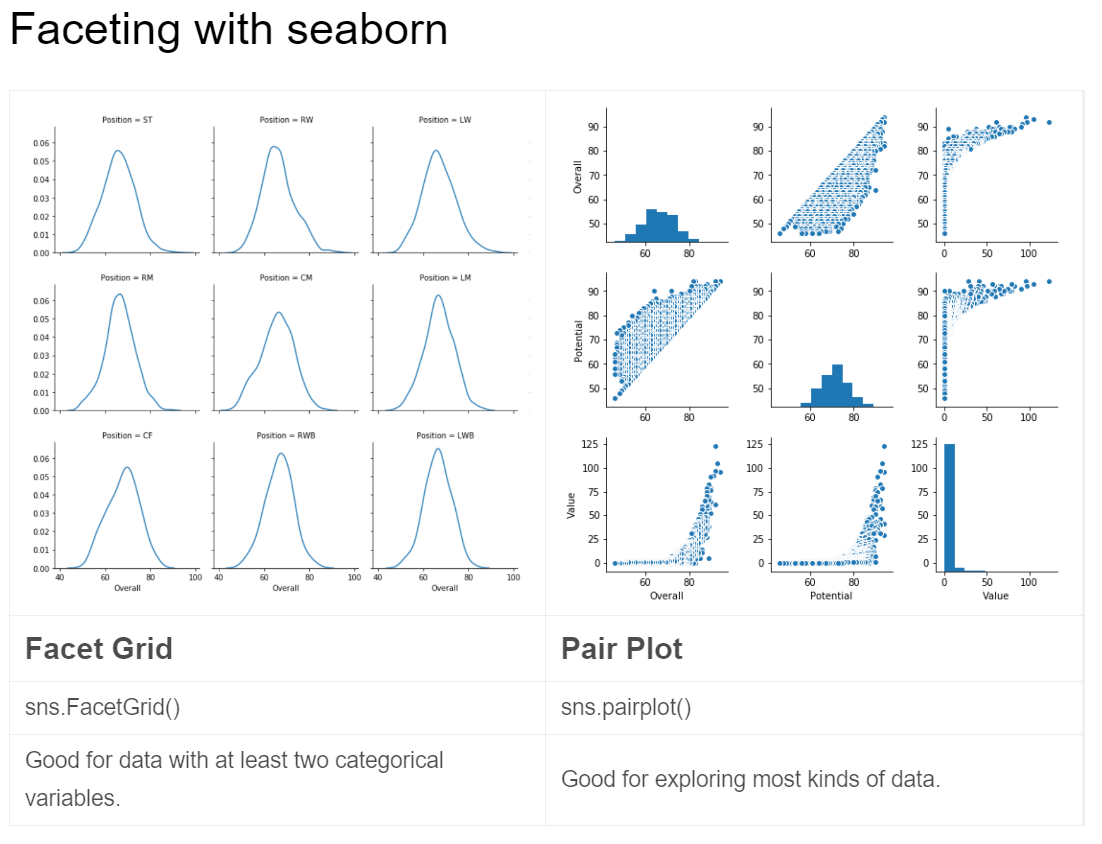
4.1. Facet Grid
Vals are the df.columns()
vals are the subconditions under the columns_index
- First, create
FacetGriddf = cf[cf['Val'].isin(['val_1', 'val_2'])]
g = sns.FacetGrid(df, col="Val",col_wrap=6)g= sns.FacetGrid(df, row = 'Val_1', col = 'Val_2'‘Val_1’ and ‘Val_2’ are two conditions of Xg= sns.FacetGrid(df, row = 'Val_1', col = 'Val_2', row_order = ['row_1','row_2'], col_order = ['col_1','col_2','col_3']give the order for row and col
- Second, use
mapobject method to plot the data into the laid-out gridg.map(sns.kdeplot,'X')
4.2. Pair Plot
- Default
pairplotreturn scatter plots in the main entries and a histogram in the diagonal.sns.pairplot(df[['X1Y3','X2Y2','X3Y1']])
5. Multivariate Plotting
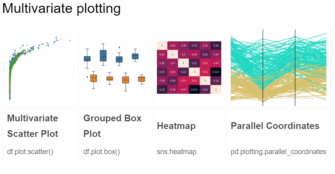
5.1. Grouped box plot
- The main difference is the
hueto group two variables into one figure
sns.boxplot(x='X', y='Y', hue='Val', data=df)
5.2. Heatmap
-
ef = (df.loc[:,['Val_1','Val_2','Val_3','Val_4','Val_5']].applymap(lambda v: int(v) if str.isdecimal(v) else np.nan).dropna()).corr()
sns.heatmap(ef, annot = True)
5.3. Parallel Coordinates
from pandas.plotting import parallel_coordinates
ef = (df.iloc[:,12:17].loc[df['Val'].isin(['val_1','val_2'])].applymap(lambda v: int(v) if str.isdecimal(v) else np.nan).dropna())
ef['Val'] = df['Val']
ef = ef.sample(200)
parallel_coordinates(ef,'Val')
6. Plotly
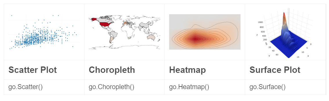
seaborn and pandas focus on building ‘static’ visualizations
plotly is an open-source plotting library which has moving parts
from plotly.offline import init_notebook_mode, iplot

init_notebook_mode(connected=True)

import plotly.graph_objs as go
6.1. go Scatter
iplot([go.Scatter(x=df.head(1000)['X'],y=df.head(1000)['Y'],mode='markers')])
6.2. go Heatmap
iplot([go.Histogram2dContour(x=df.head(500)['X'],y=df.head(500)['Y'],contours=go.Contours(coloring='heatmap')),go.Scatter(x=df.head(1000)['X'],y=df.head(1000)['Y'],mode='markers')])
6.3. go Choropleth
df = df['country'].replace('US','United States').value_counts()
iplot([go.Choropleth(locationmod = 'count')])
6.4. go Surface
df = df.assign(n=0).group(['X','Y'])['n'].count().reset_index()
df = df[df['Y']<100]
df = df.pivot(index='X', columns = 'points', values = 'n').fillna(0).values.tolist()
iplot([go.Surface(z=v)])
7. Grammar of Graphics
from plotnine import *

Top5_Val = df[df['Val'].isin(df['Val'].value_counts().head(5).index)]

df = Top5_Val.head(1000).dropna()
7.1. Scatter plot
(ggplot(df) # initialize the plot with input data df
	+ aes('X','Y') # aes(aesthetic)
	+ geom_point() # plot type
	)
7.2. Add regression line
(ggplot(df) # initialize the plot with input data df
	+ aes('X','Y') # aes(aesthetic)
	+ geom_point() # plot type scatter
	+ stat_smooth() # add a regression line
	)
7.3. Add color
(ggplot(df) # initialize the plot with input data df
	+ geom_point() # plot type scatter
	+ aes(color='X') # color the X variable points
	+ aes('X','Y') # aes(aesthetic)
	+ stat_smooth() # regression line
	)
7.4. Add facet
(ggplot(df) # initialize the plot with input data df
	+ geom_point() # plot type scatter
	+ aes(color='X') # color the X variable points
	+ aes('X','Y') # aes(aesthetic)
	+ stat_smooth() # regression line
	+ facet_wrap('~Var') # facet wrap Variable
	)
7.5. Aes
aes can be writed as a layer parameter
(ggplot(df)
	+ geom_point(aes('X', 'Y'))
	)
also in overall data
(ggplot(df, aes('X', 'Y'))
	+ geom_point()
	)
7.6. Bar plot
(ggplot(Top5_Val)
	+ aes('X')
	+ geom_bar() # bar plot
)
7.7. histogram
(...
	+geom_histogram(bins=20) # numbers of bins
)
7.8. 2D histogram
(ggplot(Top5_Val)
	+ aes('X','Y')
	+ geom_bin2d(bins=20) # numbers of bins
	+ coord_fixed(ratio=1) # box height
	+ ggtitle("Top Five Most Common Vals" # give it titles
	)
8. Time-series plotting
The two most common and basic ways to show up the datas
It often used on stock prices
stocks = pd.read_csv("../input/prices.csv", parse_dates=['date'])

stocks = stocks[stocks['symbol'] == "GOOG"].set_index('date')
- line plot visualizing
shelter_outcomes['date_of_birth'].value_counts().sort_values().plot.line() # output the simple ine plot - resample
shelter_outcomes['date_of_birth'].value_counts().resample('Y').sum().plot.line() # aggregated by 'year'
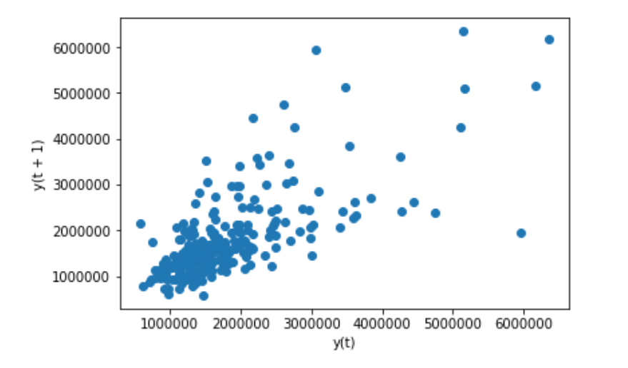
8.1. Lag plot
- A lag plot compares data points from each observation in the dataset against data points from a previous observation
from pandas.plotting import lag_plot

lag_plot(stocks['volume'].tail(250)) # volume(number of trades conducted)
8.2. Autocorrelation plot
The autocorrelation plot is a multivariate summarization-type plot that lets you check every periodicity at the same time.
It does this by computing a summary statistic—the correlation score—across every possible lag in the dataset.
from pandas.plotting import autocorrelation_plot

autocorrelation_plot(stocks['volumne']) # volume(number of trades conducted)
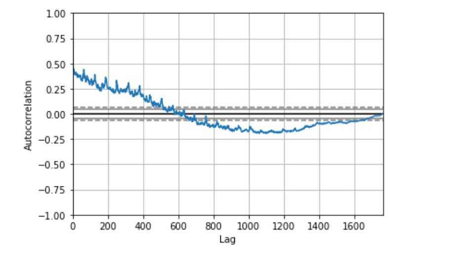
‘The farther away the autocorrelation is from 0, the greater the influence that records that far away from each other exert on one another.
It seems like the volume of trading activity is weakly descendingly correlated with trading volume from the year prior. There aren’t any significant non-random peaks in the dataset, so this is good evidence that there isn’t much of a time-series pattern to the volume of trade activity over time.’